Here's a TLDR breakdown of the core features, click on each item to learn more.
What is a shadcn theme?
A shadcn theme is a collection of CSS custom properties that define the visual appearance of your application.
These variables control colors, typography, spacing, radius, and other design tokens used across every component.
By updating these primitives, you can change the look and feel of your entire UI without modifying individual components.
Your app shouldn't look like everyone else's
The default shadcn theme presets — Vega, Nova, Maia, Lyra & Mira — from the excellent shadcn create tool are a great starting point.
These theme presets are built around a small set of design primitives defined with CSS custom properties:
theme color
base color
typography
spacing
radius
font
For many projects that baseline is enough, but when you want to add polish and personality to your UI, the theme generator takes differentiation much further.
The web is incredibly diverse
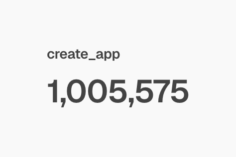
Over 1 million apps have been created with shadcn, according to its creator.
If a large portion of those applications rely on the same small set of default themes, interfaces inevitably start to look similar.
Zippystarter's theme generator lets you go far beyond that baseline by adjusting all of the global design properties that power a shadcn theme.
Instead of tweaking a handful of high-level variables, you get full control over your entire design system.
Color primitives
primary / primary-foreground
secondary / secondary-foreground
muted / muted-foreground
accent / accent-foreground
destructive / destructive-foreground
background / foreground
card / card-foreground
popover / popover-foreground
border, input, and ring
charts
sidebar
Typography
Separate controls for headings and body fonts, each control panel includes:
font-family
font-weight
tracking
Global primitives
Border width
Radius
Because these primitives are powered by CSS custom properties, updating them instantly propagates across every component in your interface.
For even more control, the generator also allows you to override primitives at the component level.
This means you can keep a consistent global theme while fine-tuning individual components.
For instance, with the button component you can control:
radius
shadows
borders
With the card control you get:
radius
shadows
borders
padding
gap
title font-size
description font-size
This layered approach gives you the speed of global theming with the precision of per-component control.
It's free to use
The shadcn theme generator is completely free to use.
There are no paywalls blocking the core functionality, so you can experiment with themes, tweak controls, and export results without restrictions.
If you’d like to save your themes, you’ll need to create a . This allows the generator to store your themes (up to 10) so you can return to them later.
Real-time customisation
Manually experimenting with themes can be slow and frustrating.
You might tweak CSS variables, jump into Figma to test an idea, ask an LLM to generate custom properties, and then switch back to the browser to see how everything looks.
That cycle can take hours.
The shadcn theme generator dramatically simplifies this process by letting you apply themes to functional shadcn components in real-time.
Instead of spending hours iterating manually, you can build a polished theme in minutes, visualize changes on components, dashboards, and charts, allowing for quick experimentation.
Light and dark mode management
All the complexities for previewing and theming in both light and dark modes are handled by the generator.
There are handy controls for switching between the two modes, and the editor's color palette will change based on which mode you are using.
All the data is saved as you go, so you don't need to worry about losing what you've done.
History controls
All changes you make are saved in history, so you can easily recover if you lose your footing.
Controls include undo, redo, and save.
Generate themes from a single color
There's a lesser-known feature embedded within the color inputs for primary, that lets you generate a complete color palette from the primary color, it's called "quick theme", toggle it on or off to generate all colours for the theme, including charts.
Chart palette generation
In combination with "quick theme" there are color strategies that can be applied to charts, choose an option from the drop down menu:
Golden
Even
Triadic
Split complementary
Tetradic
Analogous
Monochrome
If you don't understand the terminology, don't worry, just give them a try to see the effects and it will click.
Save up to 10 themes for free
With a free account you can save up to 10 themes.
This is useful when:
experimenting with multiple design directions
comparing theme variations
building themes for multiple projects
Instead of recreating styles from scratch, you can return to a saved theme and continue refining it.
Theme exporter
Once you've created a theme, you don't have to start over for the next project.
Themes can be exported as CSS variables, making them easy to reuse across multiple applications.
Because the generator works at the CSS variable level, the output integrates cleanly into most modern frameworks.
Theme registry
You can install themes directly into your project by either copying and pasting the code, or by using the shadcn CLI.
To install a theme from the registry, click the export button.
If you're picking one of the pre-built themes like Catppuccin or Nimble, and then you choose the cli tab you'll get a code snippet like this:
Depending on the package manager you use, the output will vary.
What's really awesome about the registry installation is that the fonts are now hooked up for you, once installed you'll need to target the selectors you want to apply the fonts to.
Theme presets
Theme presets from the theme registry can be installed with the shadcn cli, or you can manually export the code so you can copy and paste it into your application.
When you save a theme it will appear in a list in the theme presets panel.
Theme presets are divided into different sections including, your themes, themes and accents.
Preview a large range of shadcn components
No expense has been spared here, in real-time you can preview
dashboards
music app
component preview
cards
charts
marketing content
style guide
If there's something else you'd like to see here, let me know.
Fonts are installed automatically
Thanks to the new registry:font capability introduced in shadcn cli v4, when you install a shadcn theme from Zippystarter you will automatically get the fonts and they'll be hooked up to your next.js app automatically.
Framework Compatibility
The generated themes work with almost any framework that uses shadcn components.
Supported environments include:
React
Next.js
Astro
Vue
Svelte
Since the generator primarily outputs CSS variables, it remains framework-agnostic.
An immersive, distraction-free experience
The generator is intentionally designed to be focused and distraction-free.
The interface removes unnecessary clutter so you can concentrate on designing your theme. There are no intrusive widgets or promotional content competing for attention.
The tool was originally built for my own workflow, so the UI prioritises practicality and speed above everything else.
Conclusion
I’ve built multiple products with shadcn and know first-hand how frustrating theme customization can be without the right tooling. That’s why I built the shadcn theme generator.
Thanks for reading! If you end up creating a theme with the generator, I’d love to see it. Feel free to reach out to me on X if you have questions, feedback, or ideas for new features.
